
Polo shirt logo placement is crucial for brand visibility and aesthetic appeal. Strategic positioning enhances identity while ensuring design balance, with popular spots like chest, back, and sleeves offering versatile options.
Why Logo Placement Matters on Polo Shirts
Logo placement on polo shirts is vital for brand visibility and aesthetic balance. Strategic positioning ensures logos stand out while maintaining the shirt’s design integrity. Placement influences first impressions, making it crucial for professional and casual settings. A well-placed logo enhances brand recognition, while poor placement can detract from the shirt’s appeal. Psychological factors also play a role, as certain positions subconsciously convey trust or style. Additionally, logo size and placement must align with the shirt’s design elements to avoid overwhelming the wearer. Current trends emphasize minimalism, with smaller logos on sleeves or chests, while larger designs on the back make bold statements. Proper placement ensures durability, as logos in high-wear areas may fade faster. Ultimately, thoughtful logo placement maximizes brand impact while preserving the shirt’s functionality and visual appeal, making it a key element in effective branding strategies for polo shirts.

Classic Logo Placement Options
Classic logo placements on polo shirts include left chest, right chest, and center chest positions, offering timeless appeal and balanced branding opportunities that suit various styles and preferences.
Left Chest Placement: The Most Popular Choice
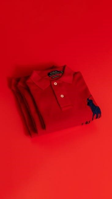
The left chest placement is the most popular choice for polo shirt logos, offering a subtle yet professional look. It is widely used for corporate uniforms and promotional apparel due to its classic appeal. Logos are typically placed 3 inches below the shoulder seam, with sizes ranging from 2.5 to 4 inches wide for optimal visibility. This placement ensures the logo is noticeable without overwhelming the design, making it ideal for both casual and formal settings. Its balanced positioning enhances brand recognition while maintaining a clean, understated aesthetic, making it a versatile option for various industries and audiences.
Right Chest Placement: A Symmetrical Alternative
Right chest placement offers a symmetrical alternative to the traditional left chest, providing a balanced and visually appealing option. It mirrors the left chest in popularity, often used for logos measuring 2.5 to 4 inches wide. Positioned 3 inches below the shoulder seam, this placement works well for brands seeking a modern twist on classic designs. It maintains professionalism while adding a touch of uniqueness, making it suitable for corporate apparel and promotional items. The right chest placement ensures visibility without overpowering the shirt’s design, offering a clean and polished look that aligns with current branding trends. Its symmetry creates a harmonious aesthetic, enhancing the overall appeal of the garment and the logo it displays. This makes it a versatile choice for various branding strategies and audience preferences.
Center Chest Placement: Maximum Visibility
Center chest placement is ideal for maximum visibility, making it a popular choice for bold branding. Logos placed here are centered and typically measure 10 to 14 inches wide, ensuring they stand out prominently. Positioned 4 to 6 inches below the neck seam, this placement draws immediate attention, making it perfect for promotional events or marketing campaigns. It works well for larger designs and offers a professional, eye-catching appeal. However, it’s important to balance the size to avoid overwhelming the garment. This placement is particularly effective for businesses aiming to make a strong visual impact, as it ensures the logo is front and center, capturing the viewer’s focus effortlessly. The center chest placement is a great way to maximize brand exposure while maintaining a clean, polished look. It’s a versatile option that suits various branding needs and audience preferences.

Back Logo Placement: Making a Bold Statement
A large logo on the back of a polo shirt grabs attention and creates a bold statement. Ideal for events, it offers maximum visibility with sizes typically ranging from 10 to 12 inches wide.
Upper Back Placement: Subtle Branding
Upper back placement offers a subtle yet professional way to incorporate branding on polo shirts. Positioned at the top of the back, this placement is less intrusive while still maintaining visibility. It works well for minimalistic designs and smaller logos, typically ranging from 6 to 8 inches wide. This placement is ideal for brands seeking a understated presence without overwhelming the garment’s design. It also complements other logo placements, such as chest or sleeve logos, creating a balanced look. The upper back is a versatile option that suits both casual and formal settings, making it a popular choice for corporate events, sports teams, or everyday wear. Its discreet nature ensures the logo is noticeable but not distracting, appealing to a wide audience.
Middle Back Placement: Full-Size Logos
Middle back placement is a bold and eye-catching option for showcasing full-size logos on polo shirts. This placement centers the logo directly on the back, typically between the shoulder blades, making it highly visible. Ideal for larger designs, it allows for maximum brand exposure, especially in crowded settings like events or gatherings. The logo size usually ranges from 10 to 12 inches wide, ensuring it stands out. This placement is particularly effective for businesses aiming to make a strong impression. It works well with high-quality, detailed designs that remain legible from a distance. Middle back placement is a great choice for those seeking to maximize brand visibility while maintaining a professional and striking appearance.
Lower Back Placement: Discreet yet Noticeable
Lower back placement offers a subtle yet effective way to display logos on polo shirts. Positioned just above the hemline, this placement ensures the logo is visible without being overpowering. It’s ideal for brands seeking a balance between discretion and brand presence. The logo size typically ranges from 6 to 8 inches wide, making it noticeable but not dominant. This placement works well for casual and semi-formal settings, allowing the shirt’s front to remain uncluttered. It’s also a great option for companies wanting to add a touch of branding without overwhelming the design. Lower back placement is versatile and suitable for various audiences, making it a practical choice for both everyday wear and promotional use.

Sleeve Logo Placement: Unique and Understated
Sleeve logo placement offers a sophisticated and subtle branding option, ideal for creating a minimalist yet distinctive look on polo shirts. Logos are typically 2-3 inches wide, ensuring understated elegance.

Left Sleeve Placement: Balanced Design
Left sleeve placement is a popular choice for polo shirt branding, offering a balanced and subtle design. This placement is ideal for creating a clean, professional look without overpowering the garment. Typically, logos are sized between 2 to 3 inches wide, ensuring they complement the sleeve’s proportions. The left sleeve provides a symmetrical alternative to the right sleeve, maintaining visual harmony. This placement is particularly effective for brands seeking a understated yet noticeable presence. It allows the logo to be visible when the sleeve is in motion, adding a dynamic element to the design. By aligning the logo with the sleeve’s mid-point, brands can achieve a polished and cohesive appearance that enhances overall branding efforts.
Right Sleeve Placement: Aesthetic Variations
Right sleeve placement offers a stylish alternative to traditional logo positioning, providing a fresh aesthetic for polo shirts. This placement is ideal for brands aiming to stand out while maintaining a professional appearance. Logos on the right sleeve are typically sized between 2 to 3 inches wide, similar to left sleeve placements, ensuring a balanced look. The right sleeve allows for creative freedom, as it can be paired with other design elements or used as a standalone feature. This placement is particularly effective for brands seeking to add a unique touch without compromising the garment’s overall design. By positioning the logo on the right sleeve, brands can achieve a modern and versatile look that appeals to a wide audience, making it a popular choice for both casual and corporate wear.
Other Logo Placement Options
Beyond traditional placements, explore unique spots like the collar, button placket, or pocket area for a distinctive, stylish brand presence on polo shirts.
Collar Logo Placement: Minimalist Approach
Collar logo placement offers a subtle and sophisticated way to incorporate branding. Positioned discreetly on the collar, this option is ideal for minimalistic designs. The logo is typically small, blending seamlessly with the shirt’s aesthetic. It works well for small text or icons, creating a refined look without overwhelming the garment. This placement is perfect for brands aiming for understated elegance, as it adds a touch of professionalism while maintaining simplicity. The collar’s minimal space ensures the logo remains unobtrusive, making it a great choice for those who prefer a low-key branding approach. This placement complements other design elements without drawing attention away from the main logo, ensuring a balanced and polished appearance.
Button Placket Placement: Elegant Integration

Button placket placement offers a sleek and understated way to incorporate branding. Positioned vertically along the button line, this placement is ideal for creating a refined, elegant look. The logo is typically small and aligned with the buttons, blending seamlessly into the shirt’s design. This option is perfect for brands seeking a sophisticated aesthetic without overwhelming the garment. The narrow space of the placket ensures the logo remains subtle yet noticeable, adding a touch of professionalism. It is particularly effective for brands with simple or text-based logos, as it highlights the detail without distracting from the overall design. This placement is also versatile, complementing other logo positions while maintaining a clean, polished appearance.
Pocket Area Placement: Retro-Inspired Design
Pocket area placement is a unique and stylish way to incorporate a logo, offering a retro-inspired aesthetic. Ideal for casual or vintage-themed branding, this placement positions the logo on the chest pocket, creating a classic, timeless look. The logo size is typically smaller, around 3-4 inches wide, ensuring it complements the pocket’s design without overwhelming it. This placement is perfect for brands seeking a subtle yet distinctive presence. It works particularly well for embroidered logos, adding texture and depth to the garment. The pocket area placement is also versatile, allowing for minimal branding that aligns with the shirt’s functional elements. This retro-inspired design choice is both practical and stylish, making it a great option for brands wanting to evoke a nostalgic or heritage feel while maintaining modern appeal.